The Printon Visual Identity System (VIS) is a comprehensive tool to guide communications of both the Printon brand and its products in a unified and consistent manner. Here you’ll find information and guidance on the various design elements that make up our visual identity.
Building recognition through consistency
By consistently presenting the Printon brand and its products, we facilitate recognition of and loyalty to our brand in the marketplace. And the higher the recognition and esteem, the more likely that customers will choose our products and services.
Highlights
Logo
At the heart of Printon’s Visual Identity System is our suite of logos. That will increase visibility and help unify our brand and products.
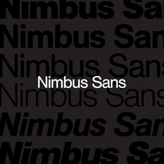
Typography provides a strong, unifying element to convey a consistent brand voice across all communications. Nimbus Sans is a distinctive and modern sans serif that is approachable, human, highly technical and conscientiously engineered.
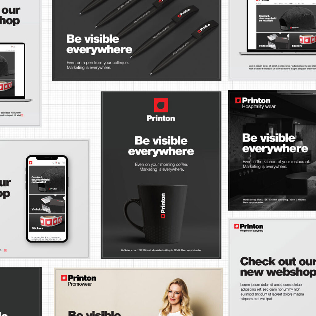
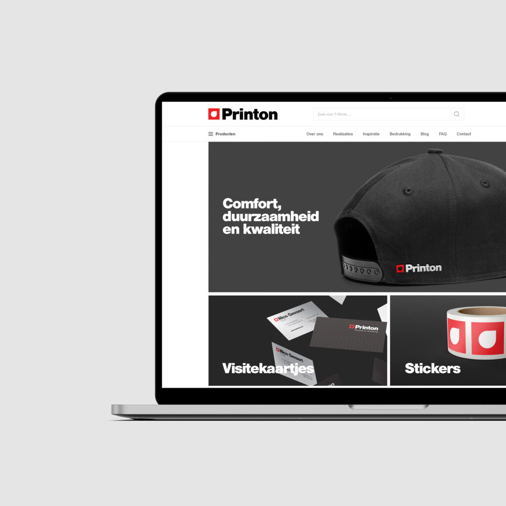
The layout framework unifies the elements of the Visual Identity System, ensuring that everything will be readable and unmistakably Printon with anchoring brand cues.
A Printon sub-brand is any current Printon branch, service or program that benefits from the master brand equity while communicating its own unique proposition.