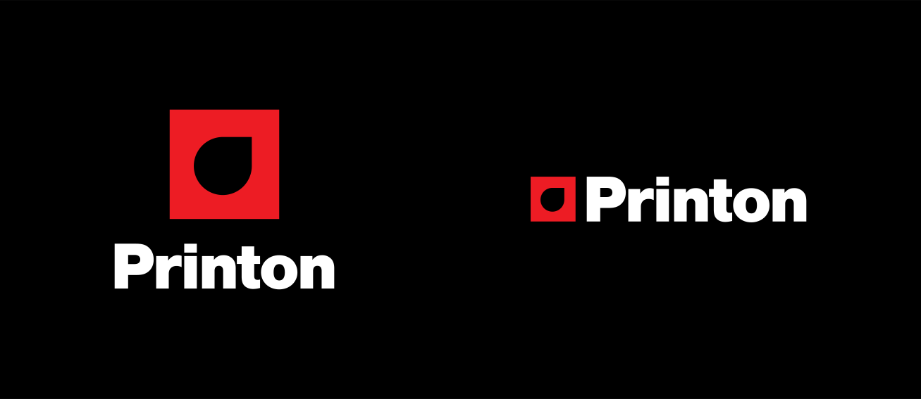
The Printon brand represents our tenets of quality, reliability and service. It also stands as a symbol to inspire people and companies. The drop represents ink on a surface and what printing stands for.

Primary logos

The staging platform or emblem

The staging platform is how we refer to the Printon emblem when shown in the red surround. The staging platform allows the emblem to be anchored and impactful. The staging platform should only be locked up with Printon, “We print on everything” or sub-brand names.

3 types of logos

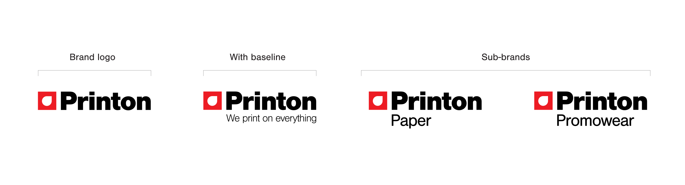
The Printon brand logos, with baseline, without baseline and sub-brand logos. Each is comprised of three elements: typography, the Printon emblem and the staging platform. These elements not only simplify and unify our brand, but also help increase recognition of our products.

Usage

Printon brand logo

The Printon logo is used when the Printon master brand is being promoted, acting as a sponsor or when multiple products or sub-brands are being marketed in the same communication. It should never be used in addition to any of the other staging platform logos in the same application.

Configurations

Clear space

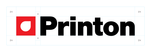
Minimum clear space around the logo ensures visibility and clarity. The Printon logo and sub-brand logos should be kept clear of other logos and design elements. To measure clear space, the layout unit of measurement, “X,” is used. “X” is derived from dividing the staging platform square into a 4×4 grid; each grid unit is equivalent to 1X. The minimum clear space required around the logo is 1X, both horizontally and vertically.

Minimum size

The minimum acceptable size refers to the height of the staging platform.
The horizontal minimum size is 9 mm high in print and 24 pixels high in digital.

Horizontal

Vertical

Color variations

Full-color logos

There are two full-color options for use across all approved logo configurations.

The full-color primary logos should be used on a white or light background, the logo foundation should be red with a white emblem and black typography. The full-color secondary logos should be used on a mid-value or dark photographic background, the logo foundation should be red with the emblem and typography in white.

Single-color logos

Use the preferred single-color staged logo when full-color production is unavailable, or when a co-branding partnership dictates the use of a single-color logo.

Single-color options

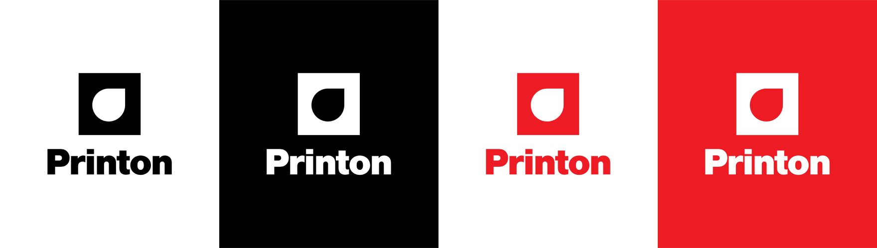
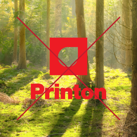
The preferred single-color options are black or Red on a white background, or a reversed white logo on a black or  Red background. While the preferred background colors are white, black or Red, alternative-color backgrounds may be used when a co-branding partner controls the background color. In such an instance, ensure that legibility and impact are optimized. The Printon logos should not be produced over a pattern or color gradation that undermines legibility.

Incorrect usage

Incorrect logo use

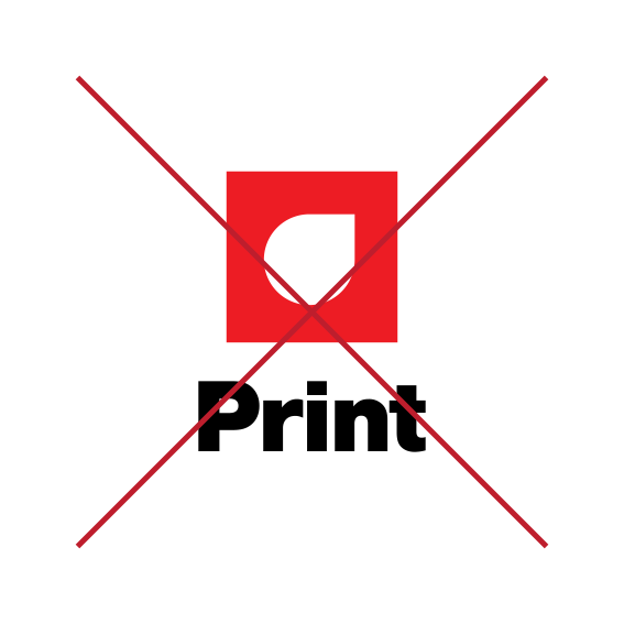
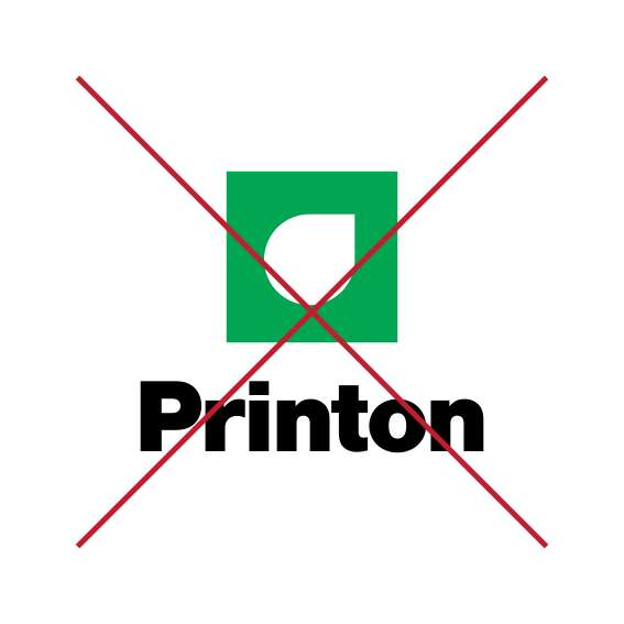
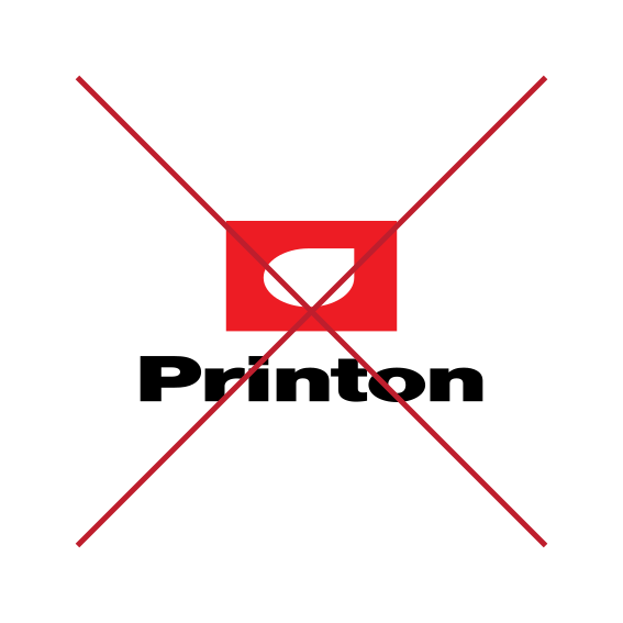
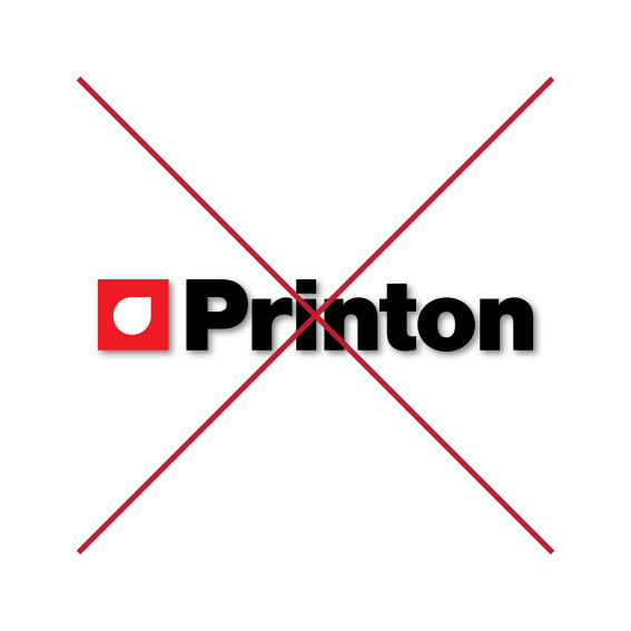
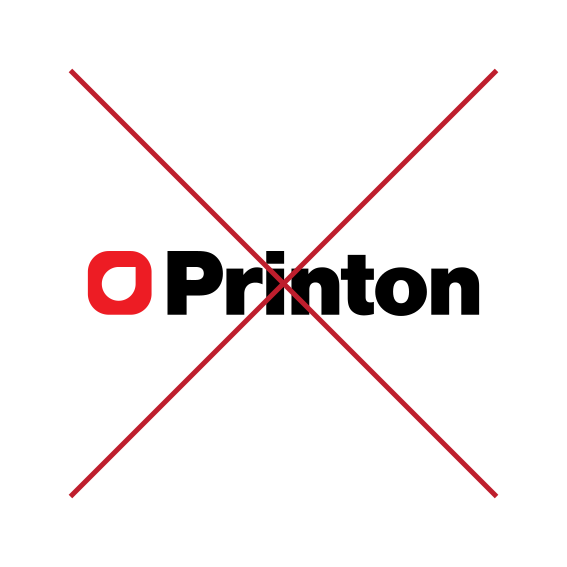
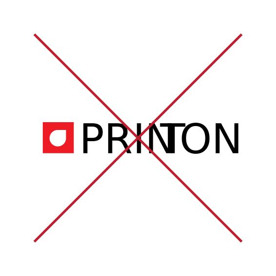
For both building brand awareness and protecting the trademark of our brand, it’s important to retain consistent and correct use of all our logos. In general, do not alter any of the logos in any way. The following examples illustrate possible misuses and simple rules to follow. These examples apply across our entire suite of logos.

Don’t alter the logo in any way
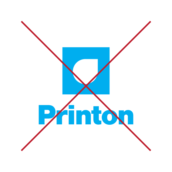
Don’t alter the logo color.
Don’t stretch or distort the logo.
Don’t add a drop shadow to the logo.
Don’t alter the staging platform.
Don’t change or alter logo typography.
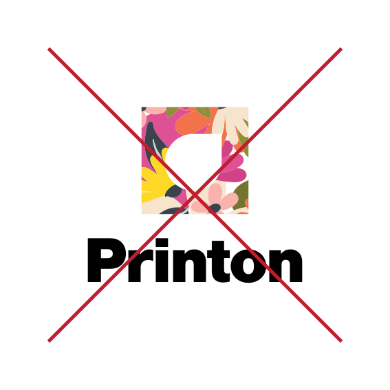
Don’t fill the logo with an image or pattern.
Always ensure significant contrast between the staging playform logo and background.
Don’t use a single-color logo in full-color production.
Don’t alter the color of the single-color logo.