
Color is a powerful means of recognition, helping establish a clear identity and distinction for Printon and our products. At the heart of our brand is Printon Red. Red is the color of energy. It is highly visible and conveys the Printon spirit of excitement.
Brand Colors
Color palette
Our color palette is simple and impactful, comprising Printon Red, white, black and gray. These are the colors of both our identity and our entire Visual Identity System. In addition to the colors inherent within photography, these are the only colors to be used in our brand communications. This concise palette of colors will help increase visual impact and overall brand recall.
Printon Red
-
Pantone 185C
-
CMYK 00 100 100 00
-
RGB 237 28 36
-
HEX #ED1C24
White
-
CMYK 00 00 00 00
-
RGB 255 255 255
-
HEX #FFFFFF
Black
-
Pantone Black C
-
CMYK 00 00 00 100
-
RGB 00 00 00
-
HEX #000000
Gray
-
Pantone Black C - 90% TINT
-
CMYK 00 00 00 90
-
RGB 65 64 66
-
HEX #414042
Grayscale
The use of grayscale colors is permitted in steps of 10% (CMYK). This to create more subtle contrast changes in digital applications.
Note: This is not advised for printing.
Color mode
Printon Red
Printon Red is the primary brand color expressed throughout the Family of logos. In marketing communications, it may also be used in typography and as a background.
White
White space allows for information to breathe and often promotes greater visibility and impact.
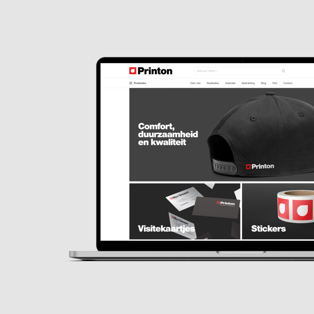

Black
Black is generally used only for typography, but may be used in other select and appropriate situations.
Gray
Gray may be used as a secondary color in headline and body text when sufficient contrast can be maintained for legibility.

Selecting the correct color mode
Color specifications are different across various media applications, therefore it is important to use the correct color mode for the specific media application to achieve the intended color values.
RGB
Website and Microsoft applications use RGB color mode.
CMYK
Digital printing from Adobe CS programs uses CMYK color mode.
Pantone (PMS)
Spot printing, screen printing and embroidery use Pantone® color modes.